Nothing here is a mock-up or a marketing render. Every view below was captured straight from a live Netapprove deployment, the same hosts, sessions, anomalies, and geo‑flows that an analyst sees on the wire. Tap or click any image to see it full‑size.
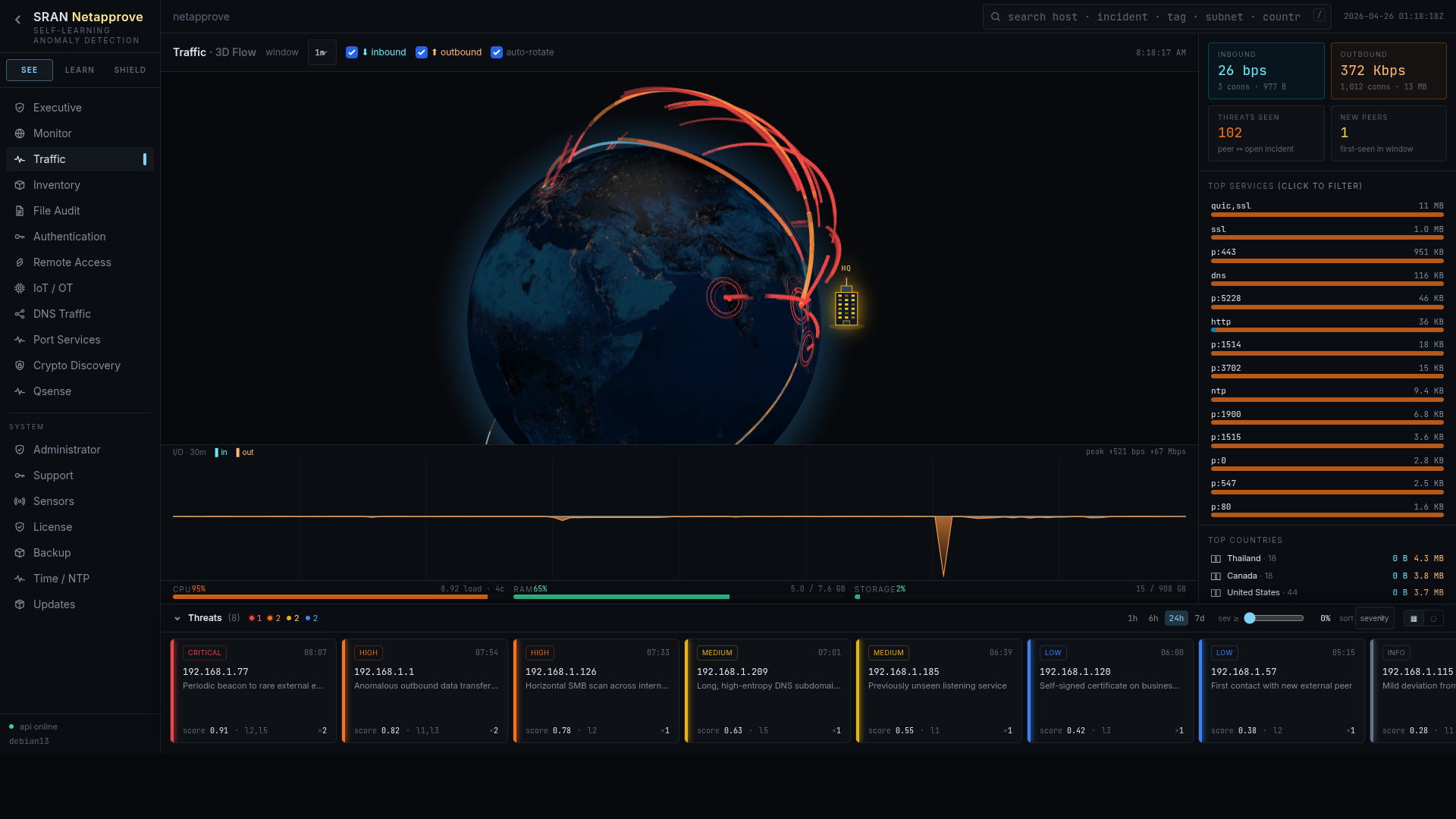
Real-time inbound / outbound arcs over a rotating earth
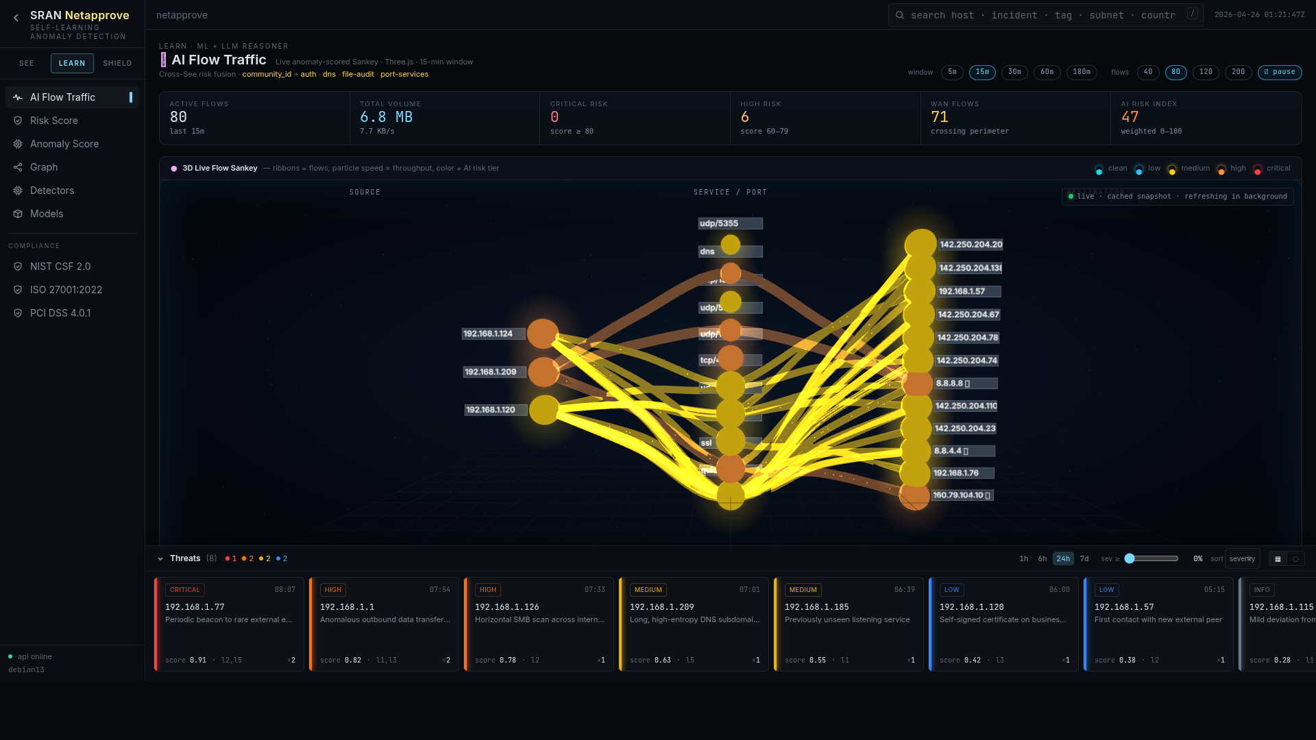
Live host → service → port lattice ranked by anomaly
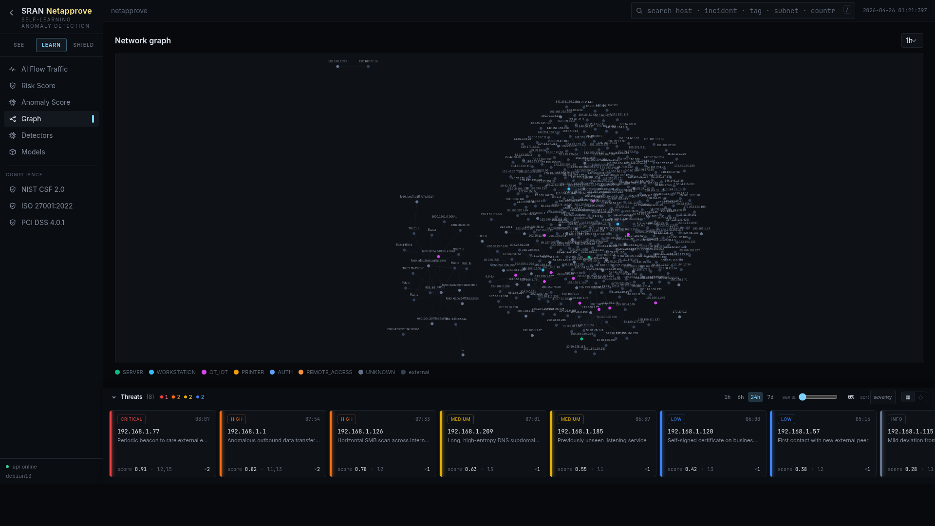
Force-directed map of every device and conversation
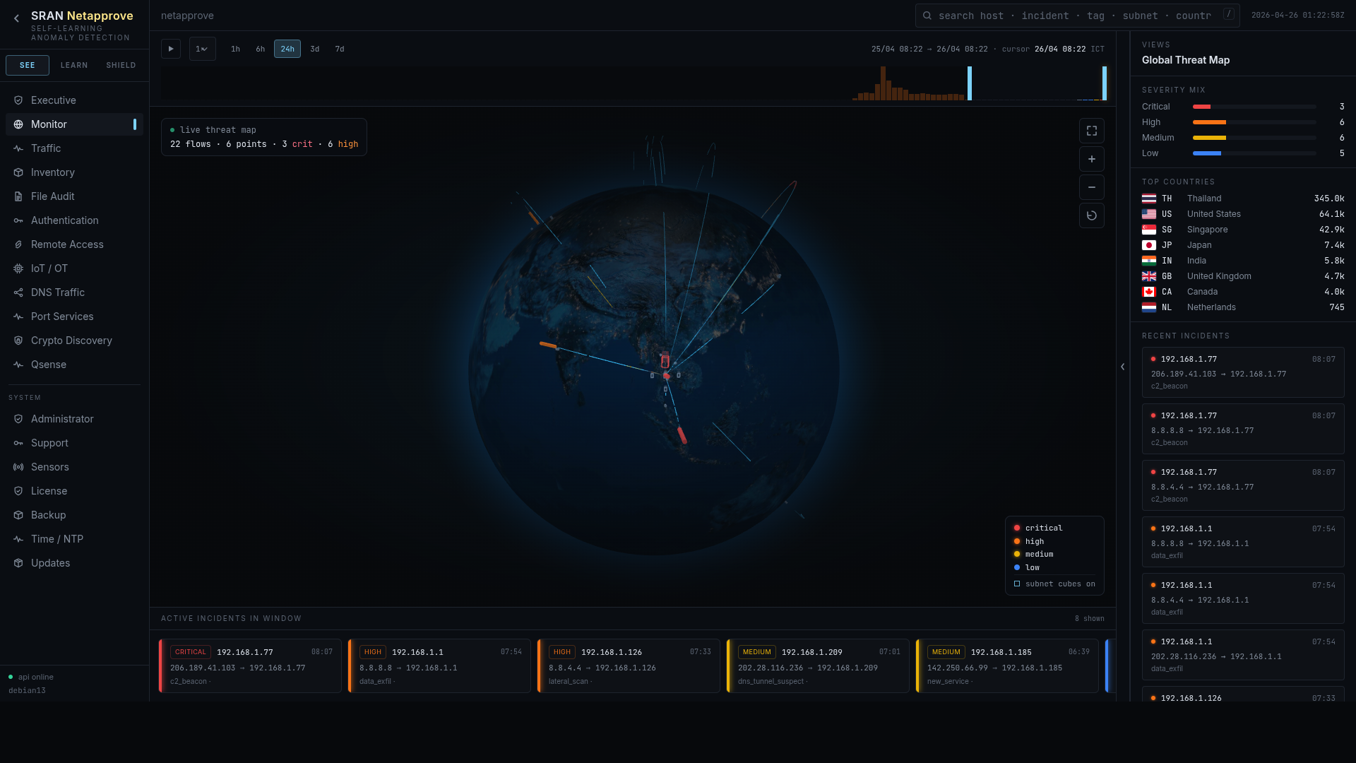
Global threat overview with recent incidents on the right
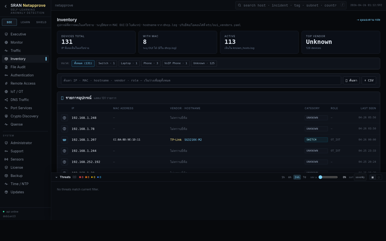
Every asset, identity, and role on the wire
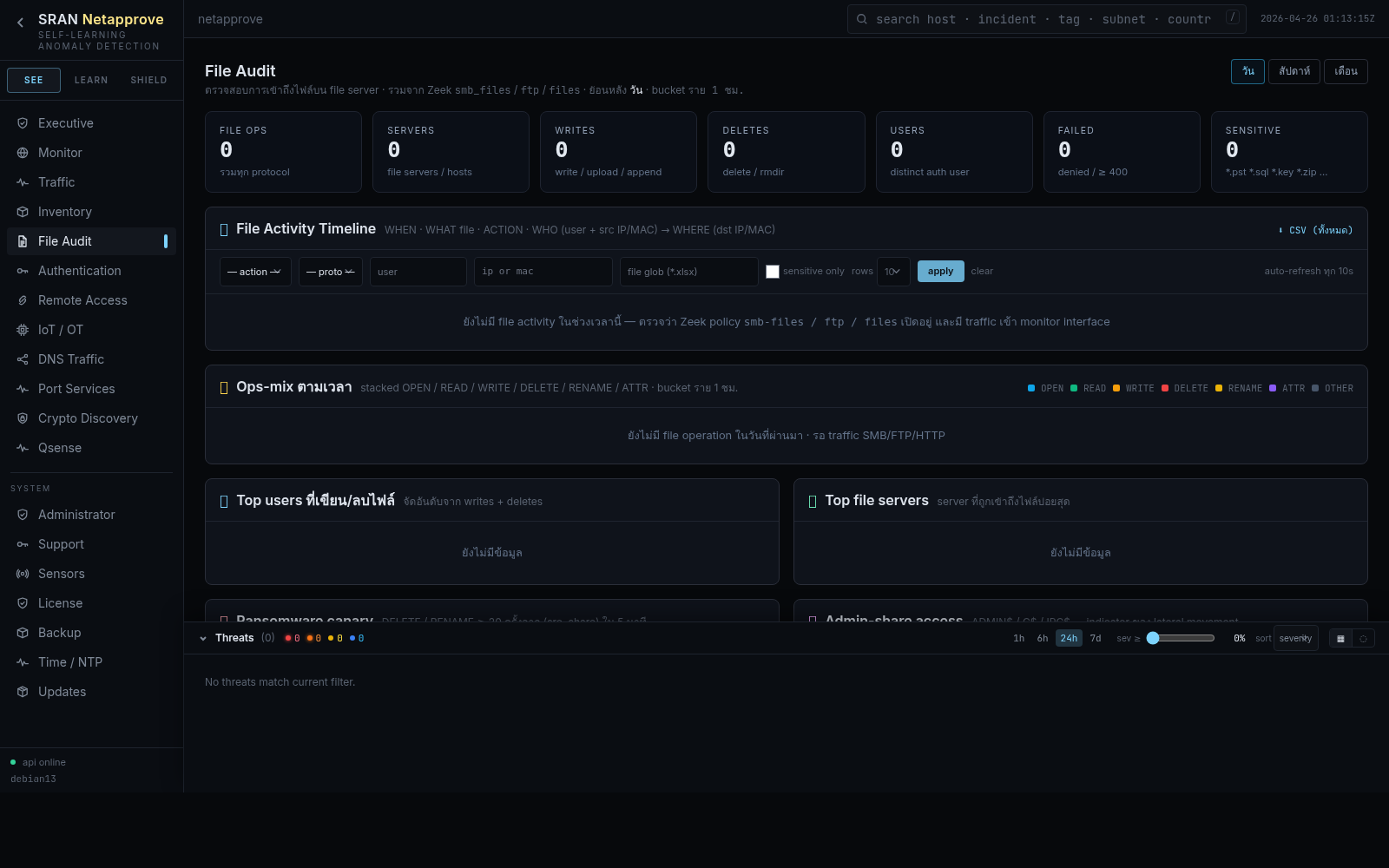
SMB, FTP, HTTP, SMTP file activity in one timeline
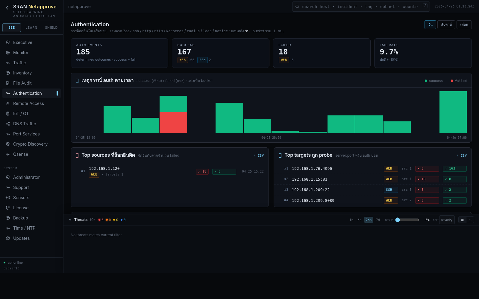
Unified login timeline across SSH / NTLM / Kerberos / RADIUS / LDAP
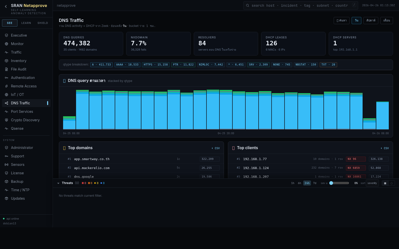
Tunneling, DGA, and beacon detection on every query
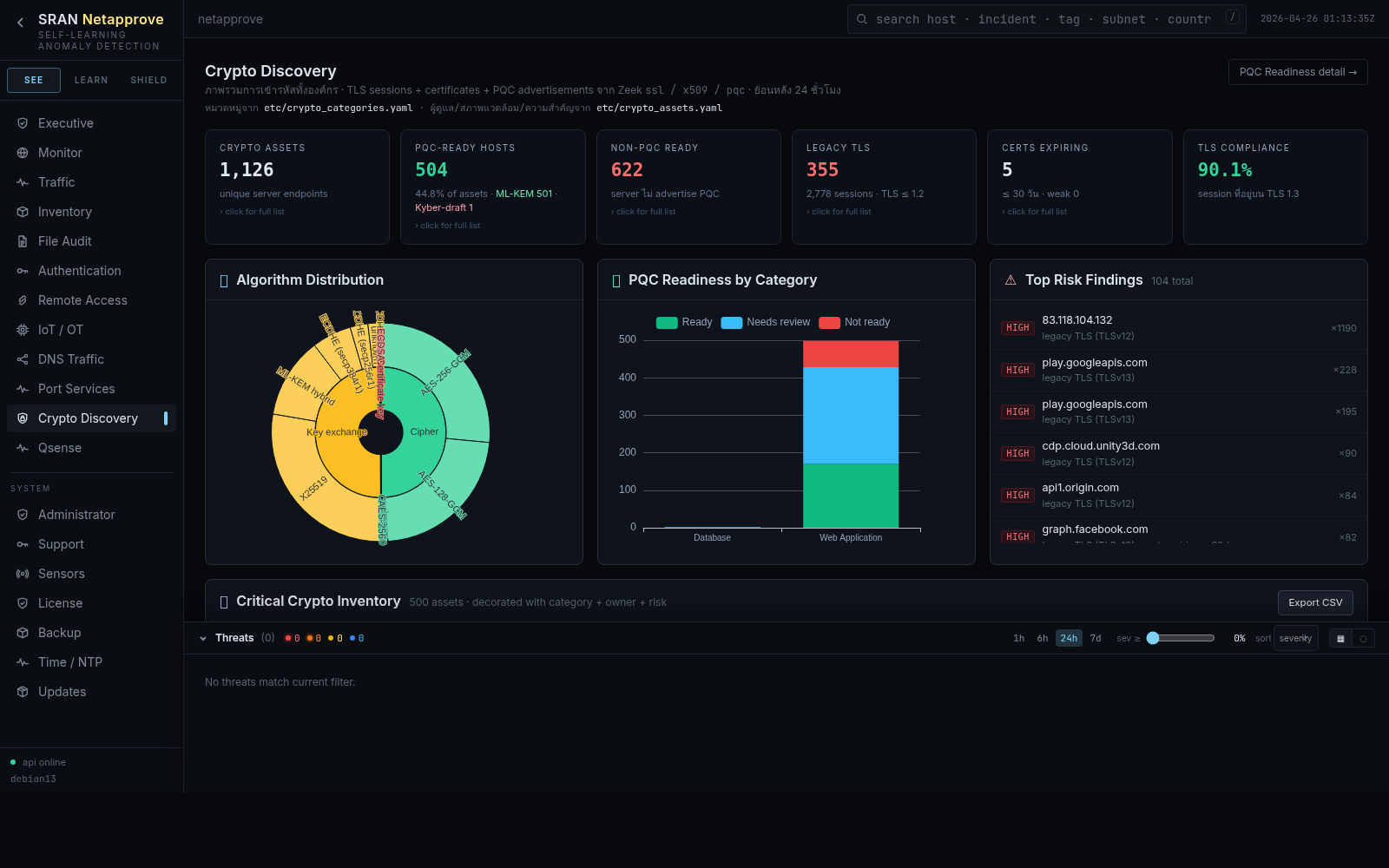
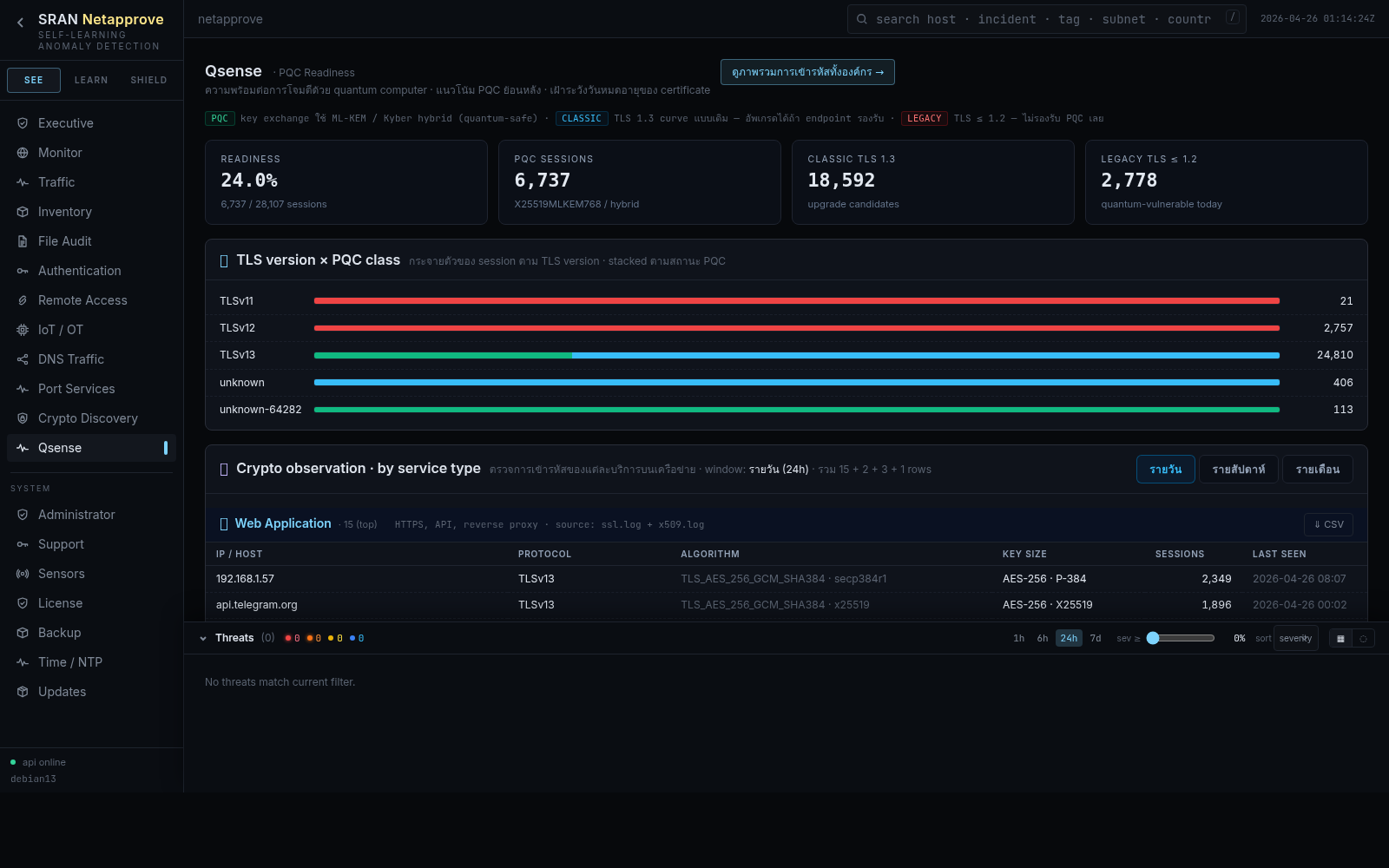
TLS / SSH / certificate inventory with PQ readiness
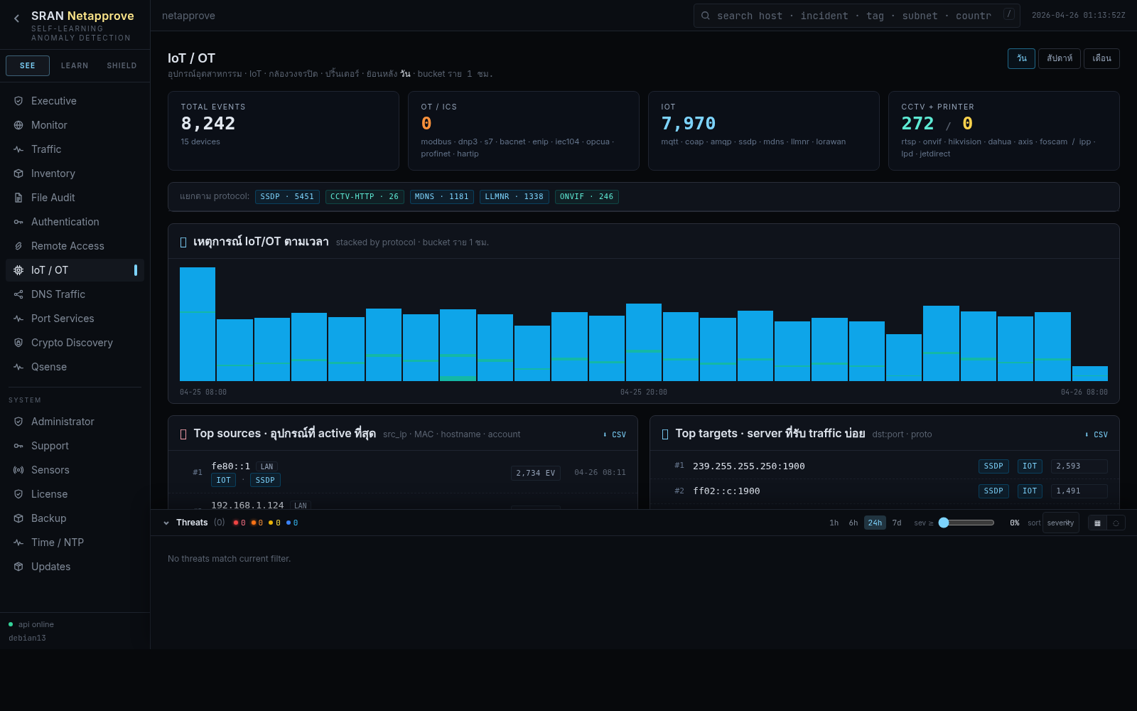
Agentless discovery for printers, cameras, PLCs
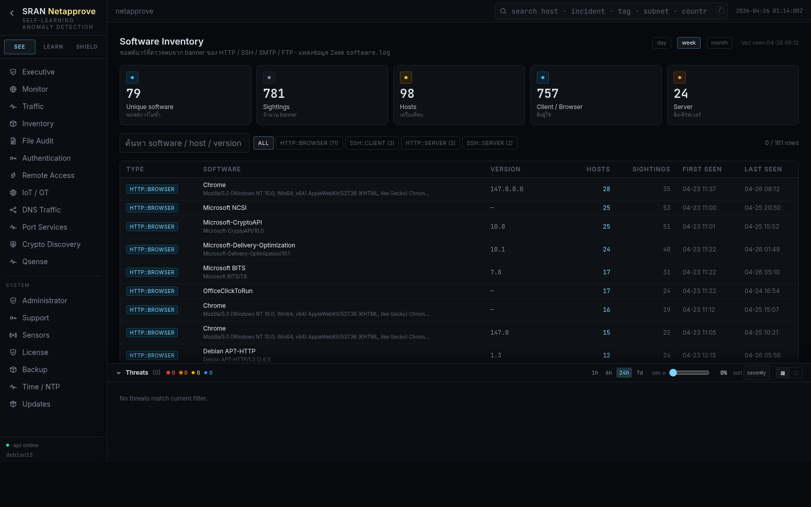
Banner-grouped software versions seen on the wire
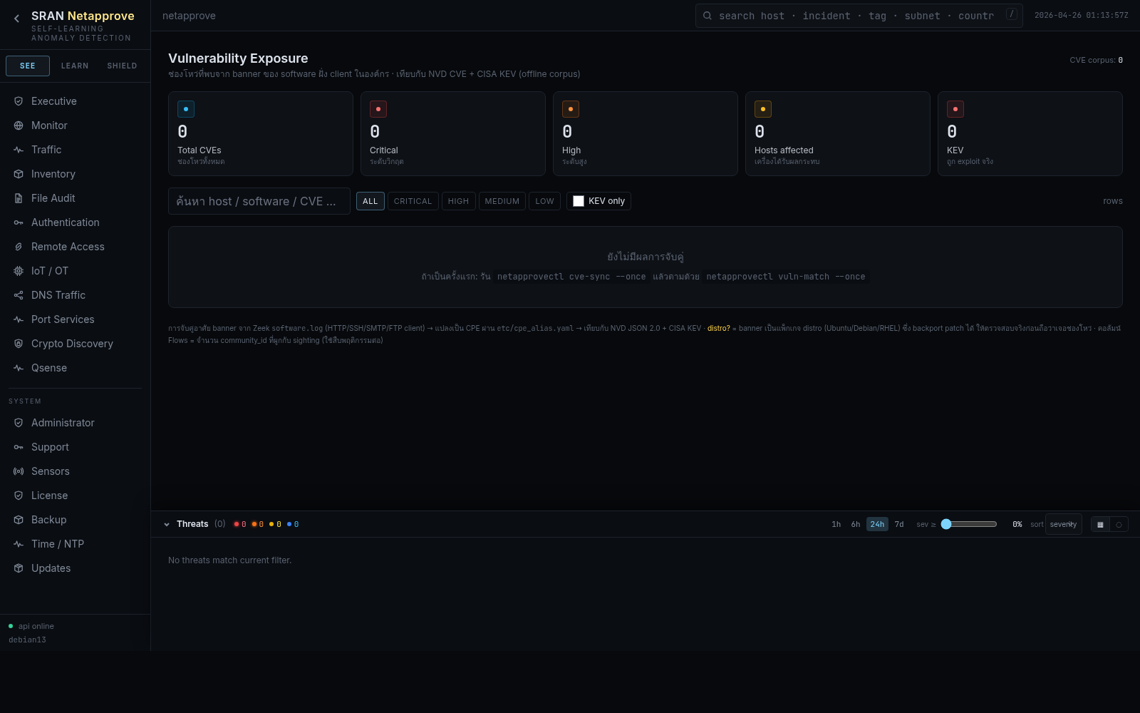
Software × CVE matching with NVD & CISA KEV
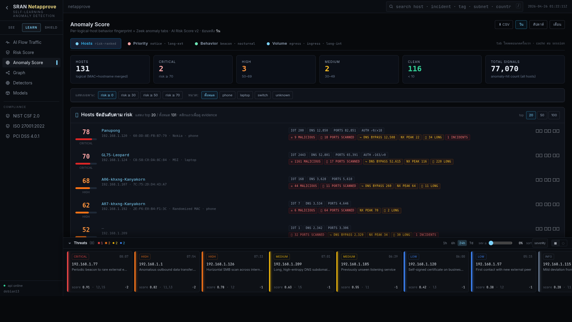
Per-asset risk score, peer baseline, AI narrative
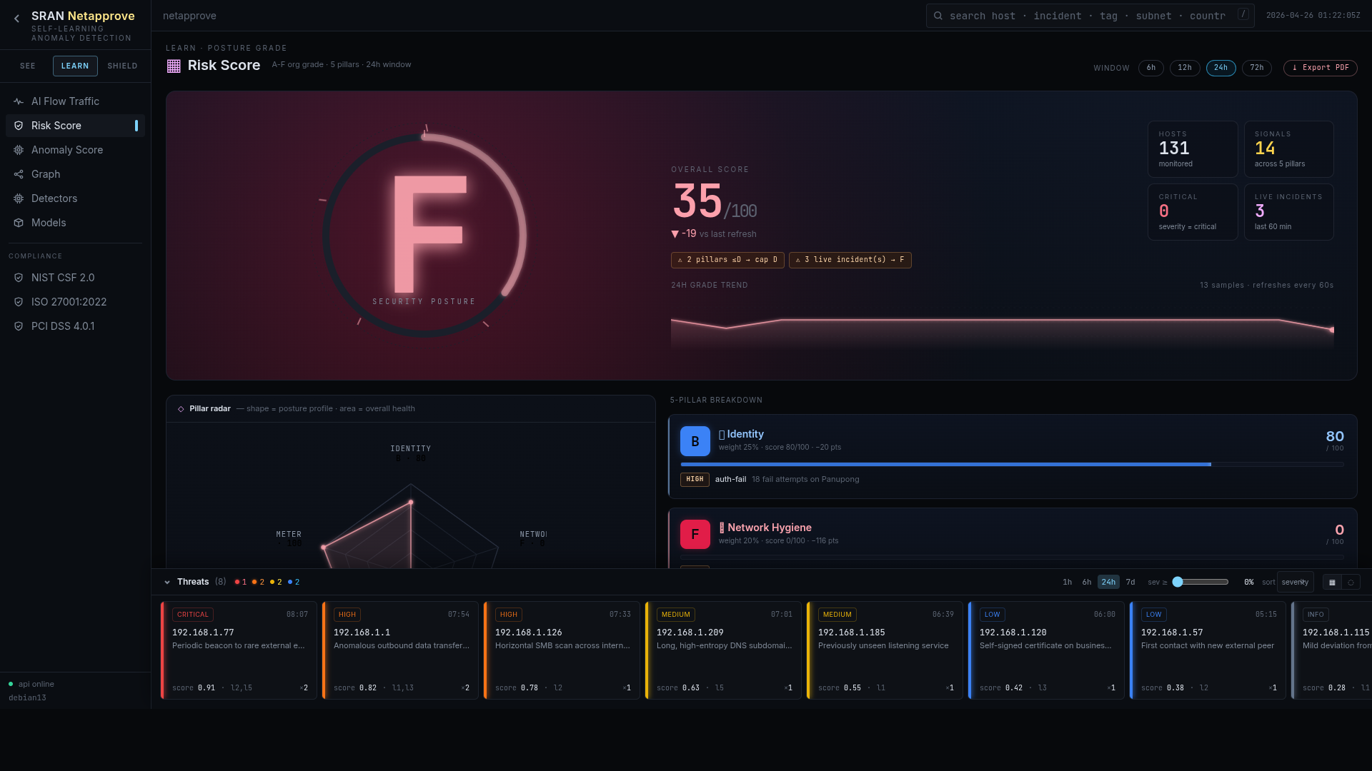
A–F org posture across five pillars, subtractive
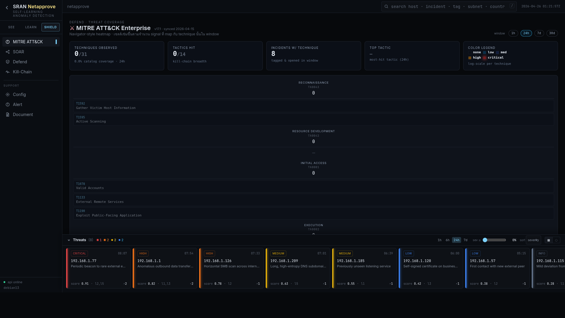
Auto-tagged technique coverage heatmap
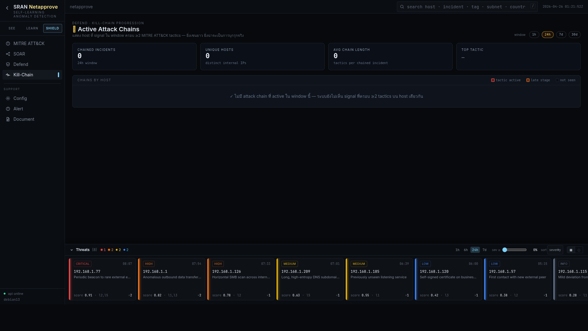
Sequenced incident timeline across phases
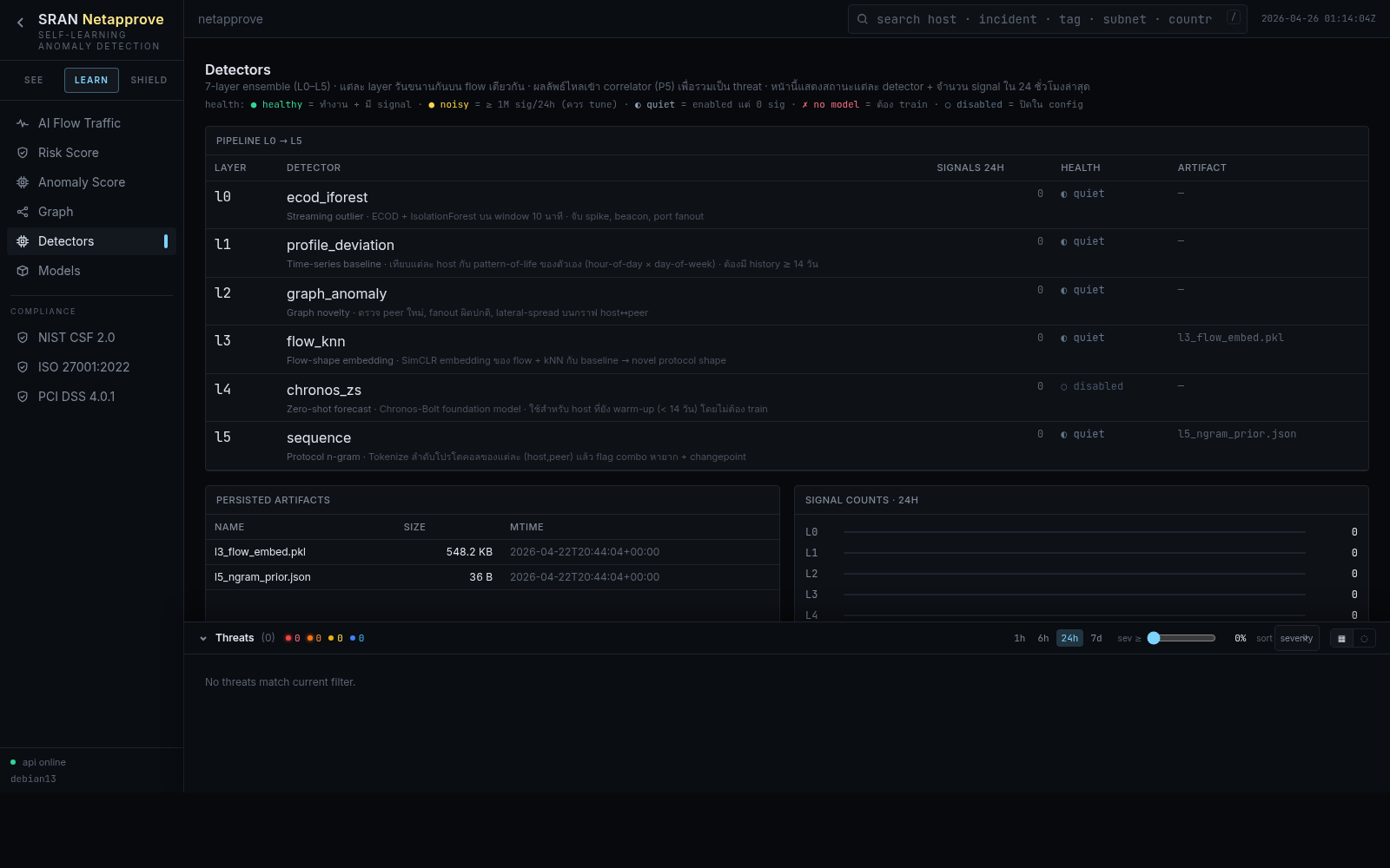
Inventory of every active detector and its hit rate
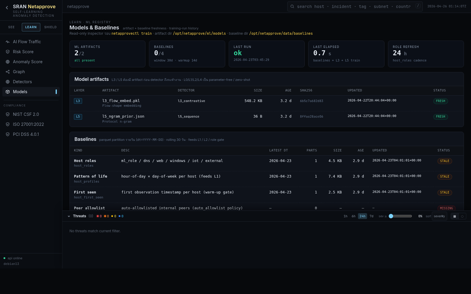
Training window, drift, weight per model
Quality-of-signal sensor health and ingest rates
Triaged incident feed with AI-written narrative
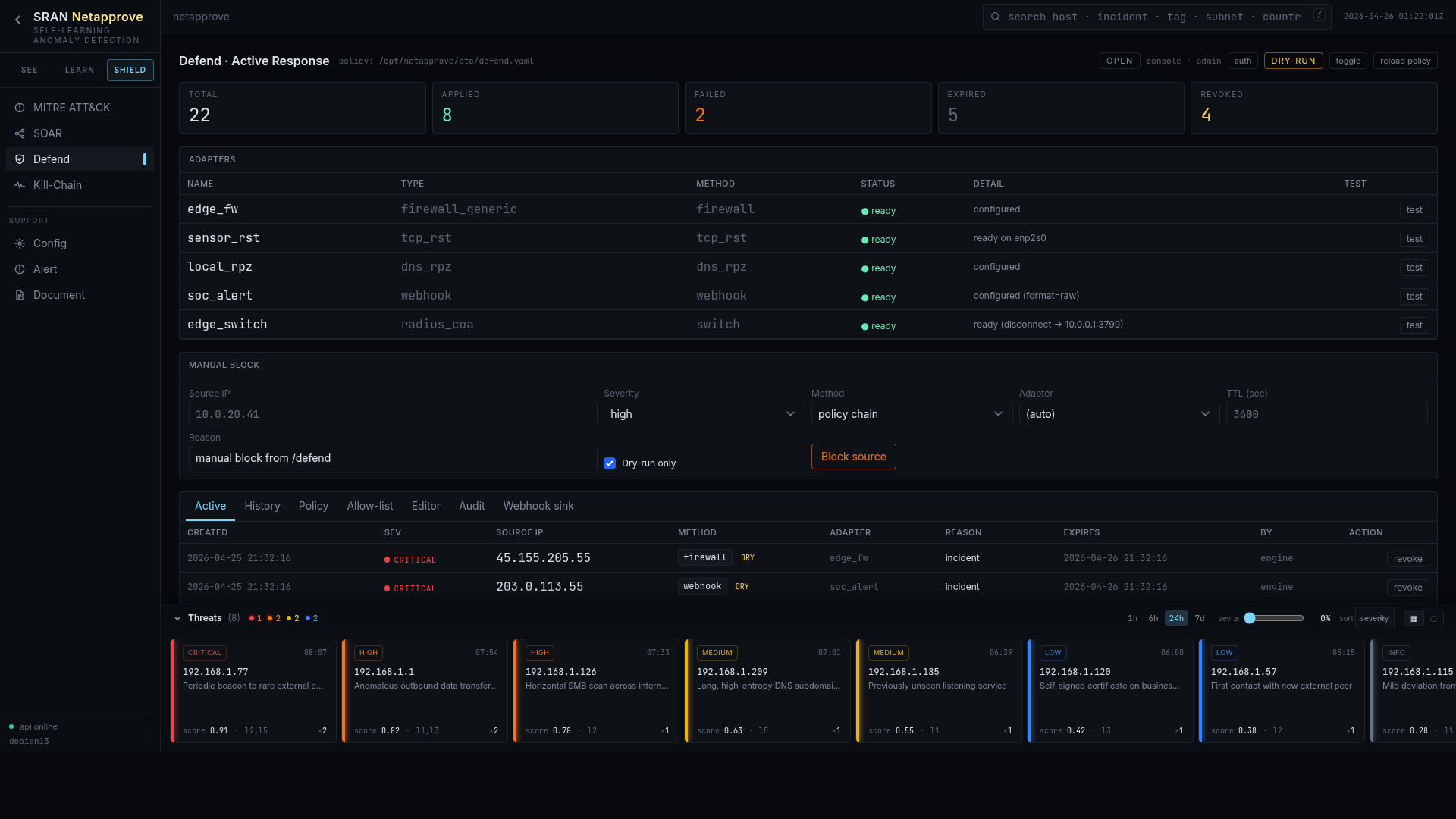
Five adapters, dry-run by default, full audit
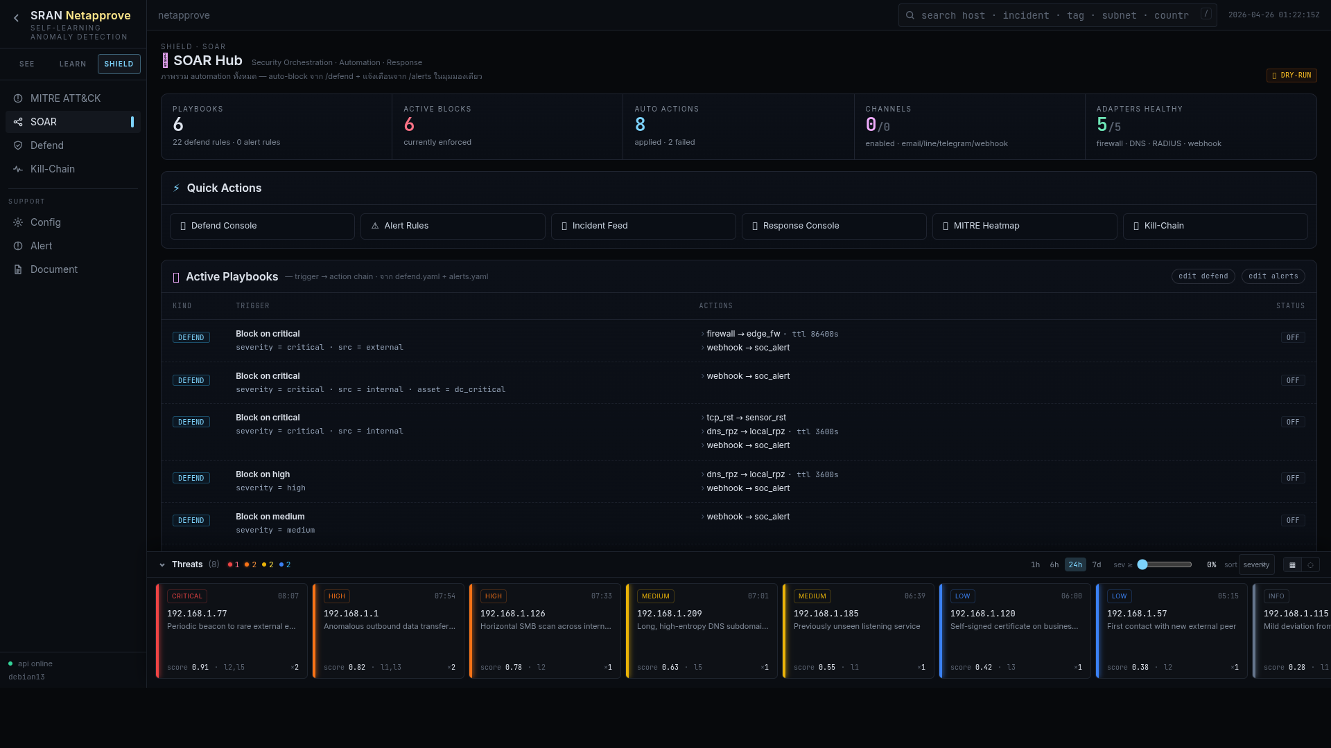
Conditional, multi-step response with rollback